

OXDH Health
OXDH builds cloud-native tools for clinics and hospitals. I designed the Patient Dashboard in its internal operations portal, so clinical staff can reach any part of a patient's record quickly.
What I worked on
Tools
About the project
Company
OXDH is a UK-based health infrastructure provider. It builds cloud-native tools for clinics, surgeries, and hospitals, including virtual waiting rooms and patient consent management.
My Role
Designed the internal operations portal, including the Patient Dashboard.
The Screen
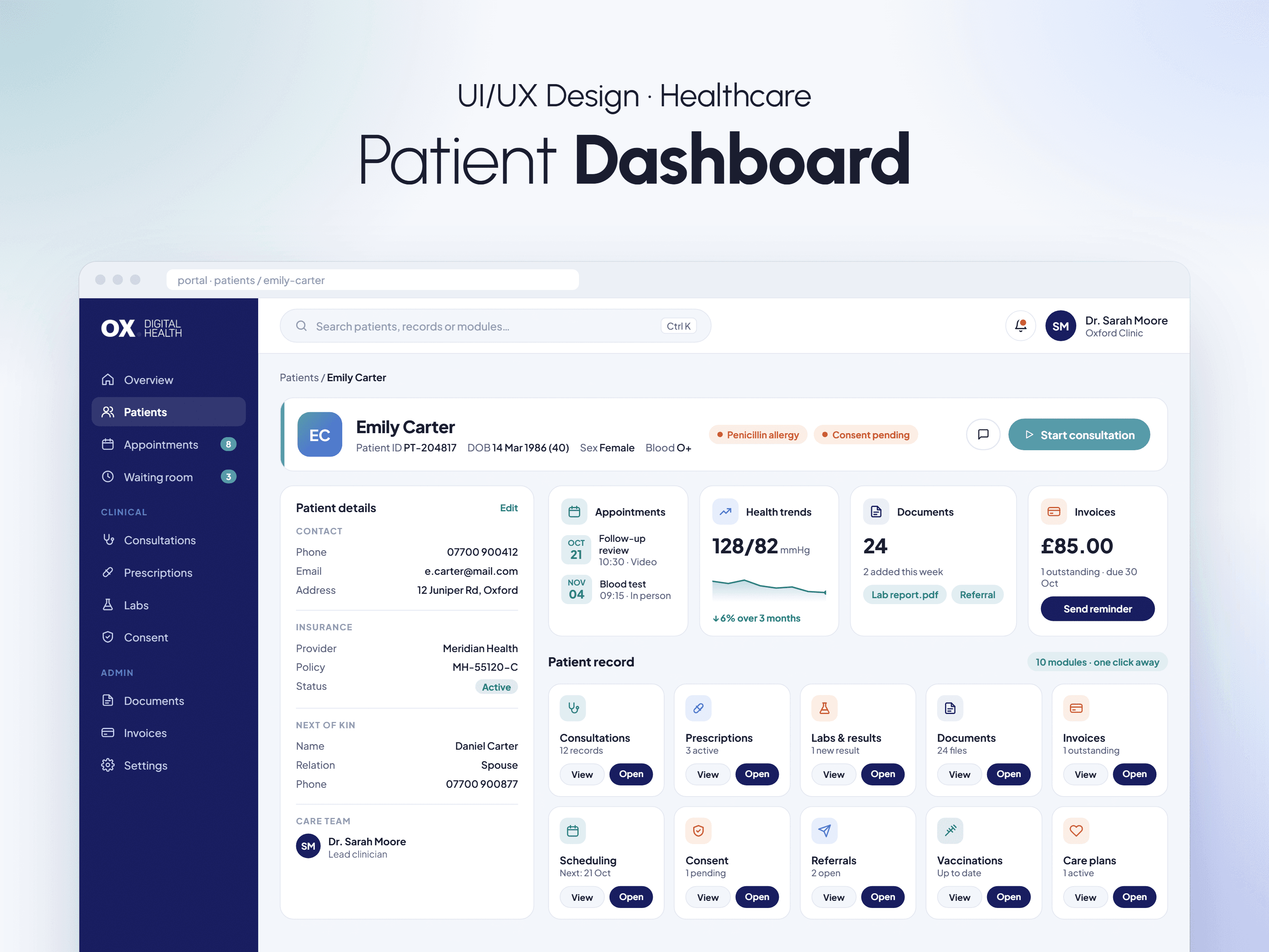
The Patient Dashboard. A single screen with a patient identity strip, a detail panel, four at-a-glance widgets (appointments, health trends, documents, and invoices), and a grid of modules for the rest of the portal.
The Problem
Clinical staff do not have time to hunt across separate systems mid consultation. Every extra click during a patient visit is time taken from the patient.
The Challenge
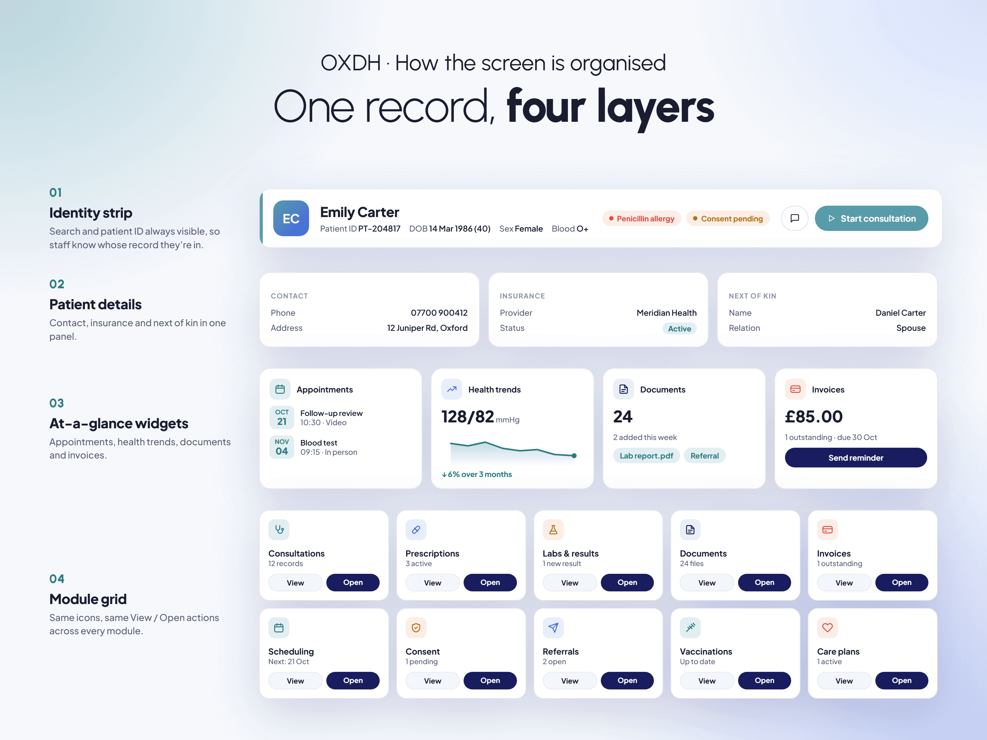
The portal contained many modules nested inside each other: consultations, prescriptions, labs, documents, invoices, scheduling, and more. Staff needed to reach any of them quickly without getting lost. I organised the dashboard into a patient identity strip, a summary panel, key widgets, and a consistent grid of modules.
What I Designed
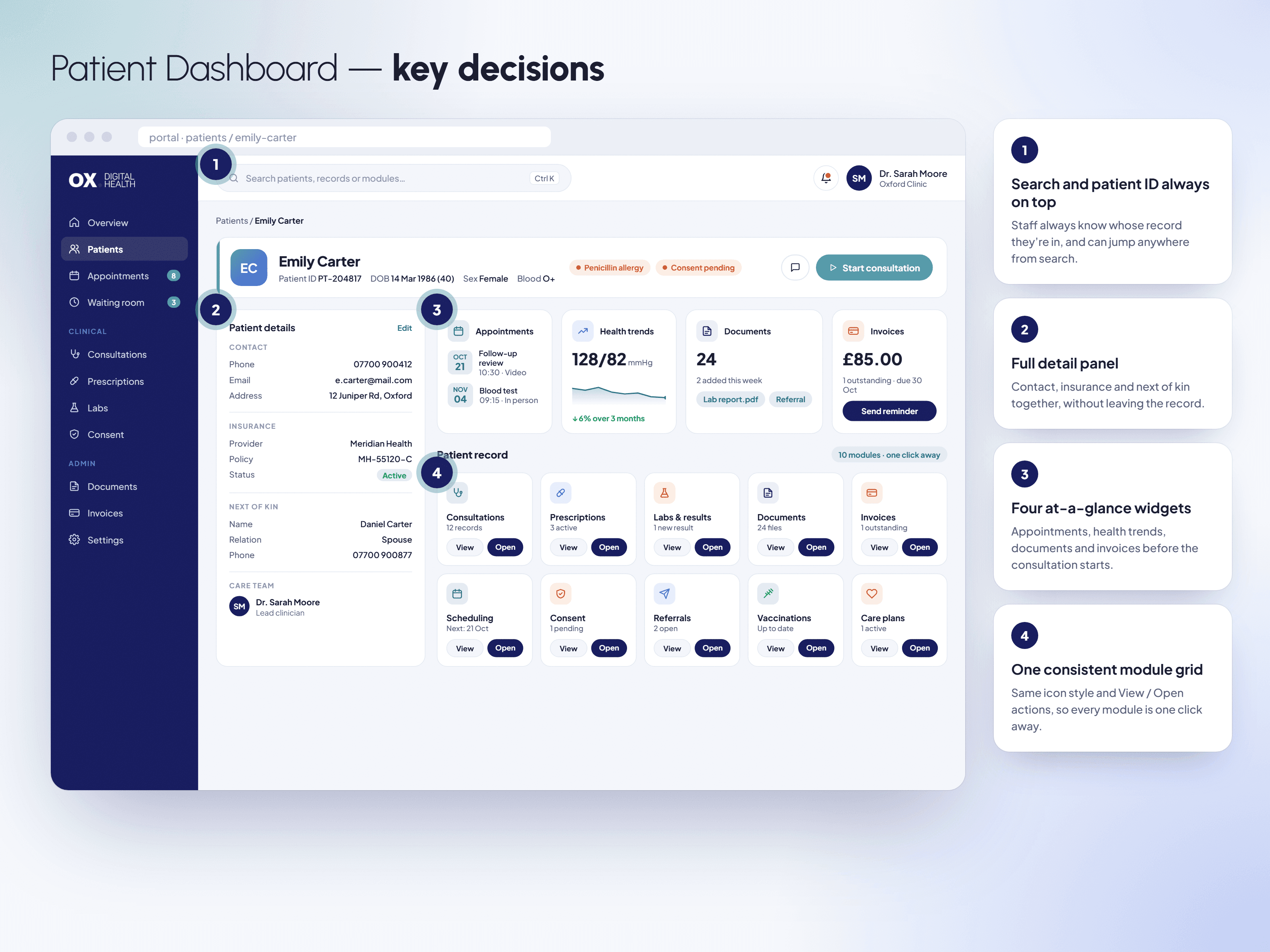
A search bar and patient ID strip always visible at the top, so staff know whose record they're in
A full patient detail panel with contact, insurance, and next-of-kin information
Four at-a-glance widgets: appointments, health trends, documents, and invoices
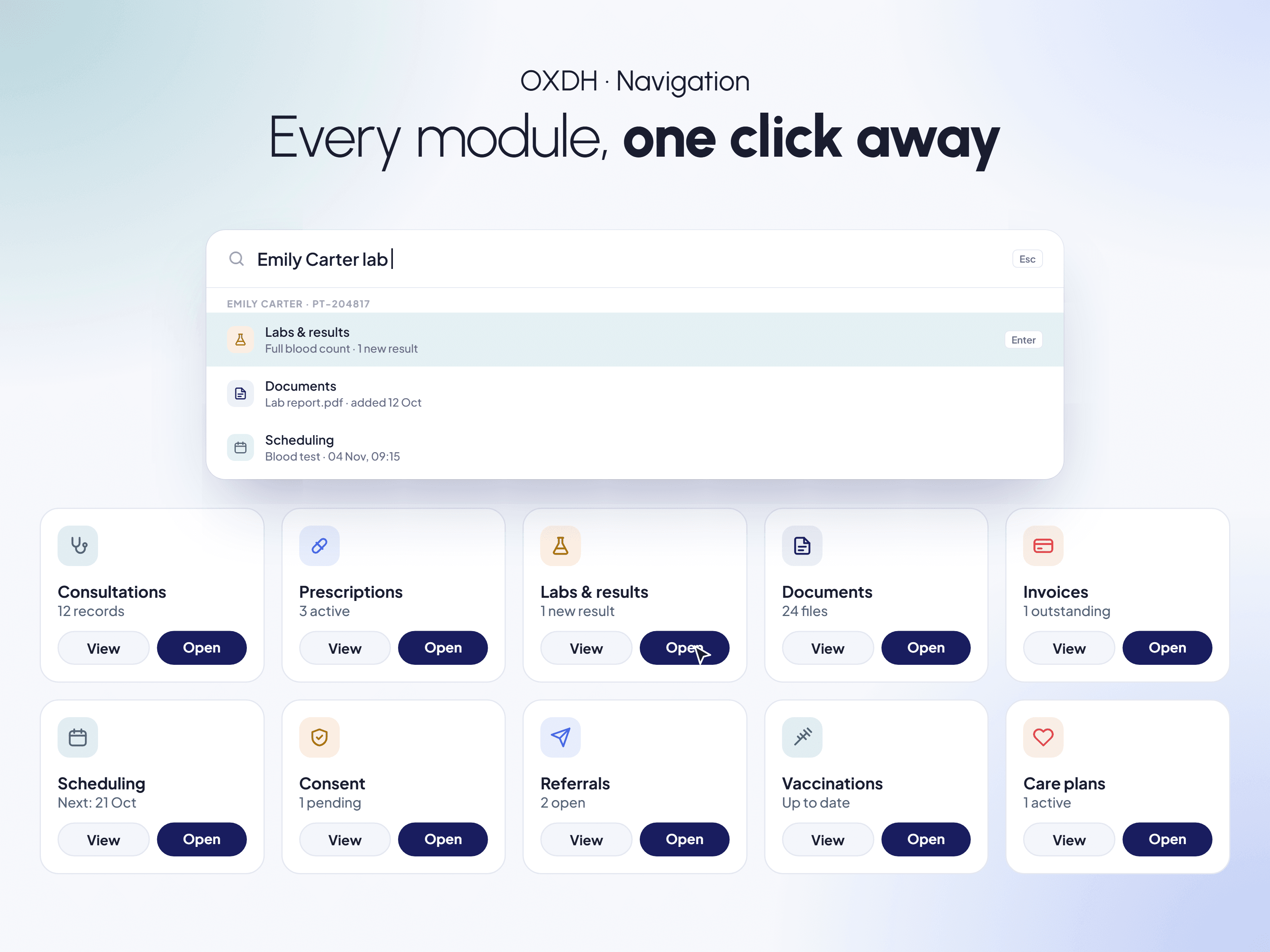
A consistent grid of modules with the same icon style and View / Open actions, so any part of the portal is one click away
What shipped
The Patient Dashboard shipped in OXDH's operations portal. Clinical staff can see a patient's identity, details, and key records in one view and reach any module from the same screen.
Trade-offs
The portal had many modules nested inside each other, so my priority was making everything easy to find. I used a consistent grid of modules with the same icons and actions, so staff can open any part of a patient's record from one screen. The trade-off is that the modules sit at the same level, which keeps navigation predictable but doesn't rank them by how often they're used.
© 2026 Anubha Singh. All rights reserved.